
TL;DR:
- A mobile-friendly website enhances user experience, improves search rankings, and increases conversions for small and medium-sized businesses. Regular audits and optimized design practices are essential to maintain performance and stay competitive in mobile search. Choosing a responsive website over a native app offers better SEO, lower costs, and instant accessibility for most SMBs.
A mobile-friendly website is one that loads correctly, navigates intuitively, and displays fully on any smartphone or tablet screen. The importance of mobile-friendly websites for small and medium-sized businesses cannot be overstated: over 64% of global web traffic now comes from mobile devices, and Google ranks your site based on how well it performs on those devices first. If your site frustrates mobile visitors, you lose both customers and search visibility at the same time. This guide breaks down exactly what that means for your business and what you can do about it right now.
How mobile-friendly websites affect search rankings
Google completed its rollout of mobile-first indexing in 2023, meaning every site is now evaluated primarily through its mobile version. That single shift changed the rules of SEO permanently. Your desktop site can be flawless, but if your mobile version is slow, incomplete, or hard to navigate, Google treats your entire website as low quality.
The consequences are direct. Mobile site quality determines your ranking on all devices, not just mobile searches. A business with a polished desktop site but a broken mobile experience will rank below a competitor whose mobile site is clean and fast, even on desktop search results. That is a counterintuitive reality many SMB owners miss entirely.
What google actually measures on mobile
Google's ranking signals for mobile sites include several specific technical factors:
- Page speed and Core Web Vitals: Google measures Largest Contentful Paint (LCP), Cumulative Layout Shift (CLS), and Interaction to Next Paint (INP) on the mobile version of your pages.
- Content parity: Your mobile site must contain the same text, images, and structured data as your desktop version. Hidden or missing content on mobile directly harms your indexing and rankings.
- Metadata consistency: Title tags, meta descriptions, and structured markup must match between your desktop and mobile versions.
- Blocked resources: If your mobile template blocks CSS, JavaScript, or images from Google's crawler, your rankings drop.
A visually appealing mobile site can still fail this audit. A site that looks fine on a phone but hides product descriptions in collapsed tabs, or blocks key scripts from loading, sends Google the wrong signals. The technical audit and the visual experience are two separate checks you need to run.
Pro Tip: Use Google Search Console's Mobile Usability report alongside PageSpeed Insights to catch both visual and technical mobile issues at the same time. Run both tools monthly, not just at launch.
What do mobile users expect from your website?
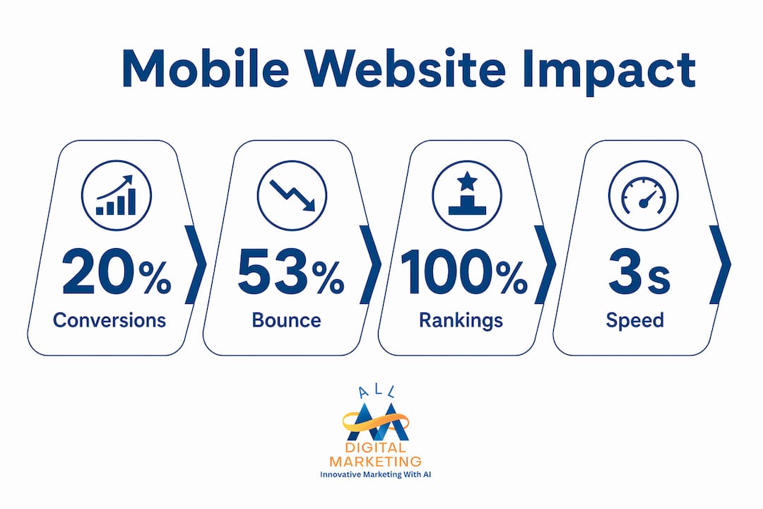
Mobile users are impatient by design. 53% of mobile visits are abandoned when a page takes longer than three seconds to load. That means more than half your potential customers leave before they even see your offer if your site is slow.
Speed is only part of the expectation. Mobile users scan content rather than read it. They use their thumbs, not a mouse. They are often on slower connections in public spaces. Mobile SEO and UX are deeply connected because the same behaviors that frustrate users also signal poor quality to search engines.

The cost of poor mobile usability
Poor mobile usability does not just annoy visitors. It costs you money in measurable ways. A one-second delay in mobile load time can decrease conversions by up to 20%. For a business generating $50,000 per month in online revenue, that single second of lag costs $10,000 monthly.
Bounce rates climb when navigation is confusing, buttons are too small to tap accurately, or text requires pinching and zooming to read. Each of those friction points represents a customer who chose to leave rather than struggle with your site.
Mobile usability factors that drive engagement
The following factors directly determine whether a mobile visitor stays or leaves:
- Load speed: Pages must render meaningful content within three seconds on a standard mobile connection.
- Touch-friendly design: Buttons and links need a minimum tap target size of 48 pixels by 48 pixels to prevent mis-taps.
- Readable text: Font sizes below 16 pixels force users to zoom, which increases frustration and abandonment.
- Scannability: Short paragraphs, clear headings, and bullet points let mobile users find answers without scrolling through walls of text.
- Simplified navigation: Hamburger menus and sticky headers reduce the effort required to move through your site on a small screen.
The importance of user experience on mobile extends beyond aesthetics. Regular testing and optimization tailored specifically for mobile users improves both conversion rates and customer retention over time.
Mobile website design best practices for smbs
Responsive design is the foundation of every effective mobile website. Responsive web design uses flexible grids and CSS breakpoints to adapt page layouts to any screen size automatically. Rather than building a separate mobile site, responsive design serves one codebase that adjusts to the device. This approach is what Google recommends and what MDN's web development documentation identifies as the standard for mobile usability.
Here is a practical sequence for SMBs to follow when building or auditing a mobile site:
- Set the viewport meta tag correctly. Every page needs
<meta name="viewport" content="width=device-width, initial-scale=1">in the HTML head. Without it, mobile browsers render your page at desktop width and shrink it down, making everything unreadable. - Start with a single-column layout. Mobile screens are narrow. Design your content flow vertically first, then add columns for larger screens using CSS media queries.
- Prioritize above-the-fold content. Load and render the content visible without scrolling first. This improves perceived speed and reduces abandonment for users on slower connections.
- Compress and resize images. Use modern formats like WebP and serve images at the size they will actually display on mobile. Oversized images are the single most common cause of slow mobile load times.
- Eliminate resource-blocking scripts. Move non-critical JavaScript to load asynchronously or defer it until after the main content renders.
- Test on real devices. Emulators in browser developer tools are useful, but real device testing on iOS Safari and Android Chrome catches issues that simulators miss.
Mobile-friendly features vs. common pitfalls
| Good Mobile Practice | Common Pitfall to Avoid |
|---|---|
| Responsive single-column layout | Fixed-width desktop layout on mobile |
| Large, clearly labeled tap targets | Small links clustered close together |
| Compressed WebP images | Full-resolution JPEG images unoptimized |
| Consistent metadata on mobile and desktop | Different title tags or missing schema on mobile |
| Visible, accessible content on all devices | Key content hidden in collapsed tabs or accordions |
| Fast-loading above-the-fold content | Render-blocking scripts delaying page display |
The conversion-focused web design approach goes one step further by aligning mobile layout decisions with specific business goals, such as phone calls, form submissions, or product purchases. Design choices that look neutral can quietly suppress conversions if they are not tested against real user behavior.
Mobile websites vs. mobile apps: which should smbs choose?
Mobile websites are the right choice for most SMBs, and the reasoning is straightforward. Mobile websites offer immediate availability, broad device compatibility, and better SEO advantage compared to native apps. A customer who finds your business in a Google search can visit your mobile site instantly. A native app requires them to find it in an app store, download it, install it, and then open it. That friction eliminates most casual visitors before they ever engage.
The practical advantages of a mobile website over a native app for SMBs include:
- No app store approval process: You update your mobile website instantly without waiting for Apple App Store or Google Play Store review cycles.
- Cross-device compatibility: One mobile website works on every smartphone and tablet, regardless of operating system. A native app requires separate iOS and Android builds.
- Lower development and maintenance cost: A well-built responsive website costs a fraction of what two native app builds require, with ongoing maintenance that is far simpler.
- SEO visibility: Mobile websites are indexed by Google and can rank in search results. Native apps do not appear in standard web search results, which means they generate no organic traffic.
- Shareability: A mobile website URL can be shared via text, email, or social media. App links require the recipient to have the app installed.
For SMBs focused on local search visibility and customer acquisition, a high-quality mobile website delivers more return than a native app in almost every scenario. The exception is businesses with a loyal, repeat-use customer base where app-specific features like push notifications or offline functionality justify the investment.
Improving your local mobile search presence through a well-optimized mobile website is a more direct path to new customers than any app strategy for most local businesses.
Key takeaways
Mobile-friendly websites are the single most important technical investment an SMB can make for search visibility, customer engagement, and revenue growth in 2026.
| Point | Details |
|---|---|
| Google ranks mobile first | Your mobile site quality determines rankings on all devices, not just mobile searches. |
| Speed directly affects revenue | A one-second mobile load delay cuts conversions by up to 20%, with measurable revenue loss. |
| Responsive design is the standard | Flexible grids and CSS breakpoints adapt one site to every screen size automatically. |
| Mobile websites beat apps for SMBs | Mobile sites offer instant access, SEO visibility, and lower cost compared to native apps. |
| Technical and visual audits are separate | A good-looking mobile site can still fail Google's indexing checks if content or metadata is inconsistent. |
What i've learned after years of watching smbs get this wrong
I am Diane, and I have spent years watching small business owners make the same costly assumption: that a website built five years ago is still doing its job. The most common version of this mistake is a site that looks fine on a laptop but falls apart on a phone. The owner never notices because they check their own site on a desktop.
Here is the uncomfortable truth. Most SMBs do not lose Google rankings because of bad content or weak backlinks. They lose rankings because their mobile site is technically broken in ways they have never audited. Hidden content, inconsistent metadata, and render-blocking scripts are invisible to the human eye but completely visible to Google's crawler.
The other misconception I see constantly is that mobile-friendliness is a one-time fix. You rebuild the site, it passes Google's Mobile-Friendly Test, and you move on. But mobile performance degrades over time as plugins update, images get added without compression, and third-party scripts accumulate. A site that scored well in 2024 can be failing Core Web Vitals by 2026 with no obvious changes made by the owner.
My advice is to treat your mobile site like a storefront. You would not let your physical location go six months without checking that the lights work and the door opens properly. Your mobile site deserves the same attention. Run a website audit at least twice a year, test on real devices, and check your Core Web Vitals in Google Search Console every month.
The businesses I have seen grow consistently online share one habit: they act on mobile performance data before problems become visible in their rankings. Waiting until traffic drops is waiting too long.
— Diane
How Digitalmarketingall helps smbs win on mobile
Digitalmarketingall works with small and medium-sized businesses to turn mobile traffic into real customers. A fast, well-designed mobile site gets visitors to your door. What keeps them coming back is your online reputation. Digitalmarketingall's review generation and management service helps you collect and manage customer reviews that build trust directly on the mobile search results page where your customers are already looking. Pair that with a mobile-optimized site and you create a complete first impression that converts. If you want to go deeper on the technical side, the SMB conversion optimization guide covers exactly how to turn mobile visitors into paying customers.
FAQ
What is mobile-first indexing?
Mobile-first indexing means Google uses the mobile version of your website to determine how your site ranks in search results. This applies to all searches, including those made on desktop computers.
How does mobile speed affect my business revenue?
A one-second delay in mobile load time reduces conversions by up to 20%. Slow mobile sites directly reduce the number of visitors who complete a purchase, call, or form submission.
What is the difference between a responsive website and a mobile site?
A responsive website uses one codebase that adapts to any screen size automatically. A separate mobile site is a distinct version of your site built only for phones, which requires double the maintenance and can create metadata inconsistencies that harm SEO.
Why should smbs choose a mobile website over a mobile app?
Mobile websites are instantly accessible without downloading, work across all devices, cost less to build and maintain, and appear in Google search results. Native apps require app store approval and generate no organic search traffic.
How often should i audit my mobile site?
Run a full mobile audit at least twice per year using tools like Google Search Console, PageSpeed Insights, and real-device testing. Check Core Web Vitals monthly to catch performance drops before they affect your rankings.