

TL;DR:
- Conversion-focused web design prioritizes user actions over visual aesthetics to generate more leads and bookings. It involves clear CTAs, trust signals, streamlined navigation, and mobile speed to optimize each stage of the sales funnel. Continuous data-driven testing, like heatmaps and A/B experiments, ensures ongoing improvements and prevents ineffective full redesigns.
Your website looks great. The colors are on-brand, the photos are professional, and your services page is polished. Yet the phone isn't ringing, and your contact form sits empty. This is one of the most common and costly disconnects in digital marketing for small and medium-sized business owners. Understanding what is conversion-focused web design means moving past visual appeal and treating every design decision as a tool to drive a specific visitor action. This guide breaks down the definition, the core elements, and exactly how to apply it to your business website to generate more local leads.
Table of Contents
- What is conversion-focused web design?
- How conversion-focused design improves your sales funnel and reduces friction
- Key elements of a conversion-focused website that drives local online leads
- Leveraging heatmaps and A/B testing to refine your conversion-focused design
- Why most websites fail at conversion-focused design and how you can avoid it
- Boost your local leads with expert review management and digital marketing
- Frequently asked questions
Key Takeaways
| Point | Details |
|---|---|
| Conversion-focused design | Design your website to guide visitors toward specific actions that increase your conversion rates. |
| Reduce friction | Simplify user journeys by removing obstacles and clarifying CTAs to boost conversions. |
| Mobile and speed matter | Ensure your website loads quickly and works flawlessly on mobile to retain visitors and encourage action. |
| Leverage user behavior data | Use heatmaps and A/B testing to understand visitor interactions and validate improvements. |
| Continuous optimization | Conversion design is an ongoing process of testing and refining based on real user feedback and data. |
What is conversion-focused web design?
Most websites are designed to impress. Conversion-focused web design is built to perform. The distinction matters enormously when your goal is generating calls, form submissions, or booked appointments.
Conversion-focused design is the practice of designing websites, especially landing pages, to increase the percentage of visitors who take a desired action by aligning page structure and user experience with visitor psychology and behavior. Every layout choice, headline, button color, and image placement serves a calculated purpose: to guide your visitor toward one specific action.
This definition of conversion design centers on intent. It asks a fundamental question about every element on the page: does this help the visitor take action, or does it distract them? Navigation menus, content hierarchy, call-to-action buttons, even white space are all evaluated through that lens.
Here are the key elements that make up a conversion-focused website:
- Clear, singular calls to action (CTAs) that direct visitors to one next step
- Value-driven headlines that immediately communicate what you offer and who it serves
- Trust signals such as customer reviews, guarantees, and credentials placed near CTAs
- Logical page structure that mirrors how visitors think and what they need to feel confident
- Streamlined navigation that reduces decision fatigue and keeps visitors focused
- Social proof in the form of case studies, testimonials, or star ratings
Understanding what is UI/UX design helps here. UI (user interface) covers the visual elements, and UX (user experience) covers how interactions feel. Conversion-focused web design pulls both together with a third layer: persuasion. You can explore more in our website conversion optimization guide to see how these principles apply specifically to small and medium-sized businesses.
How conversion-focused design improves your sales funnel and reduces friction
A sales funnel describes the path a visitor takes from first arriving on your site to completing a conversion. Most small business websites have leaky funnels. Visitors arrive, poke around, and leave without taking action. Conversion-focused web design patches those leaks.

Conversion rate optimization (CRO) is the process of increasing the percentage of website visitors who convert, and it centers on reducing friction while improving the value of what you offer. Friction is anything that slows a visitor down or creates doubt. A confusing form. A buried phone number. A page that loads slowly. A headline that doesn't match what they searched for.
Reducing friction sounds simple, but it requires discipline. Many business owners add content and features over time without asking whether each addition helps visitors act or simply adds noise.
Here is what conversion optimization strategies address inside the funnel:
- Top of funnel: Messaging clarity. Does your headline immediately tell a visitor what you do and why it matters to them?
- Middle of funnel: Confidence building. Are your trust signals visible before the visitor has to make a decision?
- Bottom of funnel: Action simplicity. Is your CTA obvious, singular, and easy to complete?
Improving your value proposition is often the highest-return change you can make. If visitors don't quickly understand why choosing you is the right decision, no design trick will compensate. Pair a strong offer with clear CTAs and well-placed trust signals, and the funnel starts working for you instead of against you.
You can explore specific CRO tools and methods to see which behavioral data tools give you the clearest picture of where your visitors are dropping off.
Pro Tip: Before redesigning anything, define your single most important conversion action. Is it a phone call, a form submission, a quote request? Every design decision should serve that one goal first.
Key elements of a conversion-focused website that drives local online leads
Theory is useful. Specific, actionable elements are better. For small and medium-sized business owners targeting local customers, the following components consistently deliver stronger results when built into the site from the start.
1. A clear, client-focused value proposition
Your homepage headline should answer three questions in under five seconds: What do you do? Who do you serve? Why should they choose you? Vague taglines like "Quality Service You Can Trust" tell the visitor nothing. "Same-day HVAC repair for homeowners in Dallas, TX" tells them everything. Visit this resource on clear messaging and value propositions for more examples.
2. Prominent, singular calls to action
Conversion-focused design makes CTAs easy to notice and points visitors toward one next step rather than several competing options. A page with five different CTAs creates hesitation. A page with one well-placed CTA creates momentum.
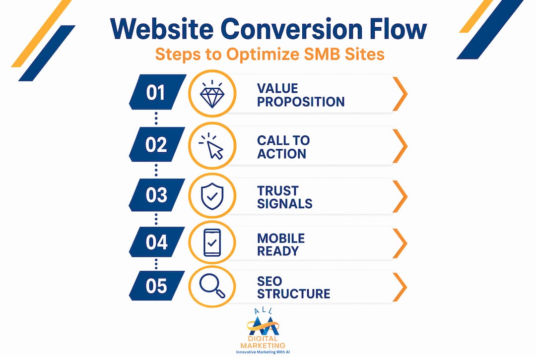
3. Trust signals placed near the point of decision
Reviews, certifications, guarantees, and before-and-after photos should appear near your CTAs, not buried in a separate testimonials tab. The visitor needs confidence before they click, not after.
4. Mobile responsiveness and fast load times
Over half of web traffic is mobile, which means your site must work beautifully on a phone. A layout that breaks on small screens or takes more than two seconds to load is actively costing you leads. Learn more about mobile search optimization for local leads to understand how mobile performance ties directly to local search visibility.
5. SEO-ready structure with local relevance
A conversion-focused site is also built to be found. Local keyword placement, proper heading hierarchy, and fast performance all contribute to search rankings and bring qualified visitors into your funnel. Review essential local service website pages to make sure your site includes the pages local customers are searching for.
Here is how these elements stack up by their impact on conversions:
| Design element | Primary impact | Conversion benefit |
|---|---|---|
| Clear value proposition | Immediate visitor clarity | Reduces early bounce rate |
| Singular CTA | Focused visitor action | Increases click-through rate |
| Trust signals near CTAs | Reduces hesitation | Boosts form and call completions |
| Mobile responsiveness | Usability on all devices | Prevents mobile drop-off |
| Fast load speed (under 2 seconds) | User retention | Reduces abandoned visits |
| Local SEO structure | Qualified traffic | Increases relevant lead volume |
Pro Tip: Run a monthly test of your site's speed and mobile usability using free tools like Google PageSpeed Insights. Conversion losses from slow or broken mobile experiences are invisible until you check.
Leveraging heatmaps and A/B testing to refine your conversion-focused design
Building a conversion-focused site is not a one-time event. Your visitors' behavior tells a continuous story, and reading that story is how you keep improving results over time.
A/B testing and heatmaps work together to give you both quantitative and qualitative insight. A/B testing tells you which version of a page element converts better. Heatmaps tell you why by showing where users click, scroll, pause, and exit.
"Combining behavioral data with controlled testing removes guesswork from design decisions. You stop assuming what visitors want and start knowing." This mindset is what separates businesses with steadily improving conversion rates from those who redesign their sites every two years without measurable results.
Heatmaps reveal where users click, scroll, and drop off, allowing you to prioritize page fixes and validate improvements with testing. Without heatmaps, you are guessing which part of the page is causing friction. With them, you can see exactly where attention dies.
Here is a practical process for using these tools together:
- Install a heatmap tool on your highest-traffic pages and run it for at least two weeks to gather meaningful data.
- Identify dead zones: Are there areas of the page visitors simply never scroll to? Move key content or CTAs higher.
- Find friction points: Are users clicking on elements that are not clickable, like images or bold text? That signals they expect a link or action there.
- Spot precision problems: On mobile heatmaps, are users tapping around your CTA button rather than on it? The button may be too small or mispositioned.
- Form an A/B test hypothesis based on what the heatmap reveals. For example: "Users are not scrolling far enough to see our CTA, so we will test moving it above the fold."
- Run the A/B test for statistical significance, typically 100 or more conversions per variant, before declaring a winner.
- Implement the winning version and restart the heatmap collection cycle on the updated page.
This process turns your website into a self-improving asset. Each cycle generates data that feeds the next round of improvements. You can review user behavior analysis tools that make this process more accessible for business owners without a dedicated analytics team. For a full walkthrough on building pages that respond to this kind of data, the high-converting website step-by-step guide offers a practical framework.
Why most websites fail at conversion-focused design and how you can avoid it
We have audited hundreds of small business websites, and the same mistake appears over and over. Business owners treat conversion problems as visual problems. They change the button color, swap the hero image, and refresh the font. Nothing moves. The phone still doesn't ring.
The real issue almost never lives in the aesthetics. It lives in the alignment between what the visitor expects and what the page delivers. When those two things are out of sync, no amount of visual polish fixes it.
Conversion-focused design is not about following visual best practices. It is about designing around the user's mental model and validating every improvement with data. A mental model is the internal expectation a visitor carries onto your page. If someone searches "emergency plumber near me" and lands on a homepage with a long company history and no immediate way to call, the mental model is broken. They expected urgency and simplicity. They got a brochure.
The most dangerous mistake we see is the full redesign reflex. A business notices low conversions and commissions an entirely new website. Six months and thousands of dollars later, results are similar. Why? Because the redesign addressed how the site looks, not where the funnel breaks. Pinpointing a single drop-off point, say, the quote request form losing 70 percent of visitors, and fixing that one thing will outperform a full redesign almost every time.
Pro Tip: Before touching any design element, use a heatmap to confirm whether your visitors are even seeing that element. You cannot fix a CTA that nobody scrolls to by changing its color.
Sustained conversion growth comes from iteration, not inspiration. Set a cadence: review behavioral data monthly, run one focused A/B test per month, and implement winners. After 12 months, your site will be meaningfully more effective than it was, and you will have data to prove it. Review the conversion optimization insights we publish regularly to stay current on what is working for businesses like yours.
The businesses that win at conversion-focused design are not the ones with the biggest budgets. They are the ones who treat their website as a living system, not a finished product.
Boost your local leads with expert review management and digital marketing
Now that you know how conversion-focused design drives leads, here's how our tailored services support your business growth. At Digital Marketing All, we help small and medium-sized businesses combine strong website design with the trust signals that actually push visitors to act. Review generation and management is one of the most direct ways to strengthen your conversion rate because fresh, visible reviews near your CTAs reduce hesitation and build credibility instantly. For businesses relying on local customers, your Yelp presence for local leads is another powerful asset we help you manage and grow. When a conversion-focused website works alongside an active review strategy, you get a complete lead generation system built for your local market.
Frequently asked questions
What exactly counts as a conversion in conversion-focused web design?
A conversion is any desired visitor action, like submitting a form or booking a call, signing up, or making a purchase that aligns with your specific business goals.
Why is mobile optimization critical for increasing conversion rates?
Because over half of web traffic comes from mobile devices, a site that performs poorly on phones causes visitor drop-offs that directly reduce your conversion rate.
How do heatmaps differ from A/B testing in improving website conversion?
Heatmaps show where visitors click and scroll to reveal user behavior patterns, while A/B testing provides statistical evidence on which design variant converts better.
Can improving website speed really impact conversions?
Yes. Websites loading under two seconds retain more visitors and increase conversions by delivering faster, more satisfying experiences that keep users engaged long enough to act.
What common mistakes should SMBs avoid when designing for conversions?
Avoid focusing only on visual tweaks without a strategy, because conversion design requires reducing friction and improving your offer, not just refreshing your colors or images.