

Prioritize fewer, clearly labeled fields in a mobile-first single-column layout with blur-triggered inline validation. That combination produces the largest, most repeatable uplift in form completion rates of any single change you can make. Everything else, from A/B testing to progressive profiling, exists to fine-tune the balance between raw conversion and lead quality once that foundation is in place.
TL;DR:
- Reducing form fields to only essential ones and employing inline validation triggered on blur can increase submission rates by over 100%.
- Segmenting form performance by device and traffic source reveals that conversion rates vary greatly, so benchmarks should be channel-specific.
- Prioritize fixing mobile input types and touch targets before testing form layout or field count to ensure accessibility and usability.
- Longer, multi-step forms with progress indicators can lower perceived effort, especially when fields are ordered from easiest to hardest.
- Focus on a quick, structured audit and iterative testing rather than complete redesigns to optimize form conversion efficiently.
Table of Contents
- How Do You Measure Form Conversion and Run a Quick Audit?
- What Are the Best Practices for Form Fields, Layout, and Mobile Design?
- How Should You A/B Test and Qualify Leads Without Losing Conversions?
- What Does the Research Actually Tell Marketing Teams?
- Where Should Marketing Teams Focus This Quarter?
- Get a Professional Audit of Your Forms
- Selected Research and Guides
- Sources
- FAQ
How Do You Measure Form Conversion and Run a Quick Audit?
Before changing a single field, you need a baseline. Form conversion rate is simply the number of completed submissions divided by the number of people who viewed the form, multiplied by 100. If 1,000 visitors see your contact form and 40 submit it, you're converting at 4%. That number alone tells you almost nothing, though. What matters is field-level abandonment: the point where people actually quit.
Here's how to find it:
- Add event tracking to every field (focus, blur, and completion events) so you can see exactly where users stall.
- Use form-analytics tools or session replay software to watch real attempts, not just aggregate numbers.
- Segment results by device and traffic source. A form converting at 6% from organic search and 1.5% from paid social isn't broken. It's telling you two different audiences arrived with two different intent levels, a distinction OrbitForms's benchmark data makes clear when it warns against comparing unlike segments.
A one-day audit checklist should cover:
- Page and form load speed on mobile
- First-field completion rate (a weak first field kills momentum before it starts)
- The top three fields where users abandon
- Whether error messages appear and if they're actually helpful
- Mobile usability: tap targets, keyboard type, scroll depth
Matomo's optimization guide recommends setting explicit form goals and removing high-dropoff fields as a first move, rather than redesigning the whole form at once. Fix what the data flags first.
What Are the Best Practices for Form Fields, Layout, and Mobile Design?
Once you know where users bail, you can apply the tactics that consistently move the needle. These aren't opinions. They're patterns that show up again and again in usability research and case studies.
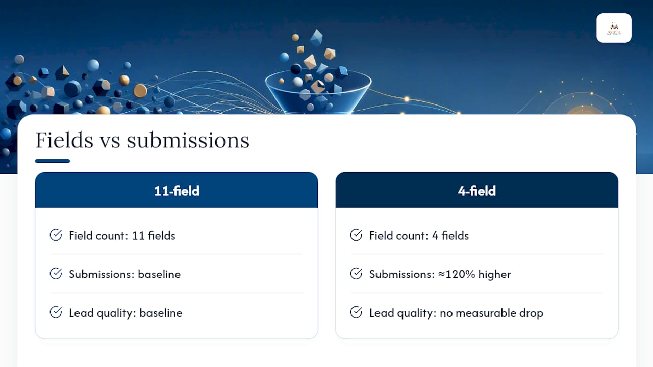
Cut fields to the ones that earn their place. Every field you add is a small tax on completion. A well-known case study found that reducing an 11-field contact form down to just 4 fields produced roughly a 120% increase in submissions, with no measurable drop in lead quality. Rank each field by business value before you build: name and email almost always earn a spot; "company size" or "budget range" might not, unless sales genuinely can't work a lead without it. When you do need more information eventually, use progressive profiling, asking for extra details across return visits or later touchpoints instead of all at once.
Stack fields in a single column. Multi-column layouts force the eye to jump around and increase perceived complexity, even when the actual field count is identical. Interaction Design Foundation's guidance on form UI backs a single vertical flow with related fields grouped visually, so a form reads like a short conversation rather than a spreadsheet.
Label clearly and mark what's optional. Skip clever placeholder-only labels that vanish once someone starts typing; they force users to remember what they were supposed to enter. Mark optional fields as "(optional)" rather than marking every required field with an asterisk nobody explains.
Validate on blur, not on keystroke. Timing here matters more than most teams realize. Validating a field the instant a user leaves it, rather than while they're still typing, has been shown to raise form success rates and cut completion time by more than 40% compared to per-keystroke validation, according to A List Apart's research on inline validation. Interrupting someone mid-keystroke to tell them their email is invalid, when they haven't finished typing it, breeds frustration, not accuracy.
Design for thumbs, not cursors. Use the correct HTML input types (email, tel, number) so mobile keyboards adjust automatically, keep touch targets at least 44 by 44 pixels, and never split a phone number or date into separate boxes. Design Systems Collective's research on high-performance forms found that enabling autofill and matching keyboards to input type measurably cuts completion time and abandonment on mobile.
Put the CTA above the fold, and make it say something. "Submit" tells the user nothing about what happens next. "Get My Free Quote" or "Start My Audit" does. Pair a strong action verb with microcopy underneath that removes friction, something like "No credit card required" or "Takes about 2 minutes."
Use conditional logic and multi-step forms when the form is genuinely long. Chunking a longer flow into steps with a visible progress indicator reduces the perceived effort even though the total work is the same, a pattern documented in The Good's research on form fatigue. The risk is adding steps that don't reduce anything, just relocate the friction. Only split a form when doing so lets you hide irrelevant fields (conditional logic) or genuinely lowers what the user sees at once.
Pro Tip: Sequence your fields from easy to hard, name and email first, multiple-choice qualifying questions next, open-ended questions last. Momentum built on quick, low-effort answers carries users through the harder questions at the end.
Solid layout and CTA placement decisions pair well with the broader principles in conversion-focused web design, and if you want deeper guidance on landing page structure specifically, 14 elements of high-converting landing pages covers the CTA and above-the-fold decisions that interact directly with form performance.
How Should You A/B Test and Qualify Leads Without Losing Conversions?
Once the fundamentals are fixed, testing tells you what to do next, and it should never stop at "which version got more submissions."
- Write a specific hypothesis. Not "test the form," but "removing the phone number field will increase submissions by reducing friction for users who prefer email contact."
- Isolate one variable per test. Change the field count, or the CTA copy, or the layout, never all three, or you won't know what caused the shift.
- Run until you hit a meaningful sample, not a fixed number of days. Low-traffic forms need longer windows to produce a trustworthy result.
- Track the test past the submit button. Look at MQL and SQL conversion rates, not just form completions. A version that gets more submissions but worse leads isn't a win.
This last point is where a lot of testing goes wrong. An analysis of 500 A/B tests on form optimization found the relationship between field count and conversion isn't a straight line: shorter forms of 3 to 5 fields tend to win on initial conversion, but the right qualifying fields, framed as a benefit rather than an obstacle, can actually improve lead quality downstream without hurting completion.
That's the case for progressive profiling. Collect the minimum upfront (name, email, maybe one qualifier), then gather more detail across later interactions: a follow-up email, a second visit, a chatbot exchange. Some teams now layer AI-assisted qualification on top of this, using behavioral signals and enrichment data to score and prioritize leads instead of asking every qualifying question inside the form itself. That keeps the form short while giving sales the context they need.
What Does the Research Actually Tell Marketing Teams?
Field count and conversion don't move in a straight line. Cutting an 11-field form to 4 fields produced a roughly 120% jump in submissions in one case study, and inline validation timed to blur events lifted success rates while cutting completion time by more than 40%. Neither gain required sacrificing lead quality.
Two heuristics follow directly from that. First, sequence fields from low effort to high effort, which builds momentum instead of front-loading resistance. Second, treat qualifying fields as a separate design decision from friction reduction: cut what doesn't earn its place, but don't strip out the one or two fields that actually help sales prioritize.
Before launching any test, an agency-tested short checklist helps:
- Confirm the baseline conversion rate and top three drop-off fields
- Fix mobile input types and touch targets before testing anything else
- Test field count and CTA copy separately, not together
- Apply progressive profiling only after the initial form is already lean
Where Should Marketing Teams Focus This Quarter?
If you only have time for three things, run a one-day audit, fix mobile input types and touch targets, and launch a single A/B test on field count. That order matters. Fixing what's visibly broken always beats testing a hypothesis on a form nobody can comfortably fill out on a phone.
This isn't a solo project. Pull in analytics for the baseline data, UX for the layout fixes, and sales for a plain conversation about which fields they actually need to qualify a lead. Skipping that last conversation is how marketing teams end up stripping a field that felt unnecessary but was quietly doing real work for the sales pipeline.
Measure past the submit button. A form that converts better but sends sales worse leads hasn't improved anything, it's just moved the problem downstream.
— Diane O'Brien
Get a Professional Audit of Your Forms
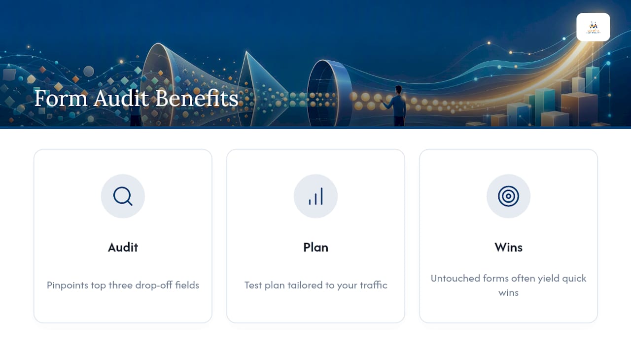
Reading a checklist and running the actual field-level analysis on your own site are two different jobs, and most marketing teams don't have the hours to do both well. Digital Marketing All builds conversion-focused websites and runs the field-level audits, A/B tests, and mobile usability checks described above as part of full-scale website conversion optimization programs for small and mid-sized businesses. Instead of guessing which field is costing you leads, get a structured audit that pinpoints your top three drop-off points and a testing plan built around your traffic, not a generic template. If your current form hasn't been touched since launch, that's usually where the easiest wins are sitting. Visit the Digital Marketing All agency page to request an audit and see where your form is actually losing people.
Selected Research and Guides
For deeper reading: A List Apart on inline validation, the 500 A/B test synthesis, and Digital Marketing All's conversion web design practices.
Sources
FAQ
Is a 12% Conversion Rate Good for a Form?
Benchmark data from OrbitForms shows conversion rates vary widely by channel, so compare your form against similar traffic sources, not a single industry average.
What Are the Stages of a Conversion Funnel for Forms?
Most funnels move through awareness, interest, form view, field engagement, submission, and post-submission qualification (MQL to SQL). Tracking each stage separately, rather than just "viewed" versus "submitted," reveals exactly where a form is losing people.
What Are the Best Practices for Designing Forms?
Use a single-column layout, minimize fields to what the business genuinely needs, validate on blur rather than per keystroke, and design mobile inputs with the correct keyboard type and touch target size. Digital Marketing All applies these same principles when building conversion-focused websites for clients.
What Are Some Tips for Improving Form Conversion?
Start with an audit to find your top three drop-off fields, fix mobile usability issues first since they tend to have the biggest impact, and test one variable at a time rather than redesigning the entire form at once. Progressive profiling lets you collect additional data later instead of asking for everything upfront.